I’ve put this together to follow on from the simple summary of the basics posted at the beginning of September. I know that glossaries like this are usually written after everything important has been said but sometimes it’s much more interesting to reverse the logical order. Besides, part of my purpose in writing things here is to organize information for myself and I find it easier to locate things if they’re arranged alphabetically. The lexicon is a starting point; a framework which will be built upon. For example, illustrations are certainly needed, but I have too little time to spare for these at the moment.
This lexicon will go in the Technical Drawing section, but as usual I’m previewing it as a post mainly so that I can tag the contents.
A4-A0 paper sizes, see ‘ISO 216’
Breaking the line i.e. if a structure or distance needs to be shown condensed (because the whole can’t be fitted on the paper, or space needs to be saved). Shown with a wavy or jagged break line.. or two, spaced a little apart. Obviously this is only an option if no information is lost by doing this i.e. for a completely plain wall or a regular pattern. What’s most important is that the true length of the wall should always be clearly indicated with a written measurement.
CODING
‘Coding’ is a recognized term used in technical drawing to describe the cross-referencing of parts of a drawing, either within the same sheet (i.e. relating an elevation to its place on the ground-plan) or from one sheet to another, often when details of a structure in an elevation need to be drawn in a bigger scale on a separate sheet. One could just call this ‘labelling’ in normal language, but as the name implies shorthand letter codes are used rather than words and it relies on everyone understanding how to read them. Using just letters and numerals rather than descriptive words has proven more effective in practice .. they take much less time to write, and they are more easily found and recognized!
For example, the simplest method when cross-referencing parts on the same sheet would be to label or ‘code’ a drawn view of a wall as ‘Elevation A’ and place the same ‘A’ beside its representation on the ground-plan. Both the style and the symbols do vary. In whatever case though, it must be made clear not only the direction seen from but also the ‘point’ in space seen from (especially with sections).
‘Coding’ when it means referencing a part of a drawing within a number of separate sheets of drawings must include both the view title i.e. ‘Elevation A’ or ‘Elevation A-A’ and the sheet number where the corresponding drawing can be found. Often this information is conveyed with a small circle cut in half with for example the elevation letter written in the top half and the sheet number below it. Connected (often surrounding the circle) is an arrow pointing towards what this relates to.
Obviously one definite common sense ‘rule’ is that the letter ‘A’ or ‘A-A’ (describing the extent of the view) should only be used once on the same sheet, but it can be used for something else on a separate numbered sheet.
In addition to whole views, smaller elements are sometimes easier to label with a letter, for example if a specific door is labelled ‘Door C’ on groundplan and elevation rather than having to write ‘the upstage door on the stage-left side of the fireplace …’
Construction drawings Technical drawings are not, strictly speaking, construction drawings! They show what is to be constructed, but not how. In theatre/film/television it is generally understood that the designer’s responsibility extends only so far as to describe the visible form and not necessarily define how it will be constructed .. though it is certainly appreciated if the designer has some knowledge of construction methods, especially an awareness of what’s possible or reasonable!
However, there are some common exceptions to this. For example, if a theatre set needs to be broken up into small pieces for touring (a fact which, hopefully, the designer will know before starting to design) it is not only pretty vital that the breaks are decided in consultation fairly early on, but also that the designer works them into the design and indicates them on his/her drawings. Often this will need to take account of standard sheet timber sizes etc.
The more complete and accurate a designer can draw up exactly what he/she wants, the less work there is for the construction manager to convert what’s given into proper construction drawings.
Drafting or ‘draughting’ if anyone is not content to use the simple word ‘drawing’ in this context, there is some confusion about which of these two other words should be chosen. There’s no difference in meaning between them. ‘Drafting’ implies mechanically assisted and measured drawing, while ‘draughting’ is the older English version which is steadily being replaced .. although ‘draughtsman’ still seems to be more commonly used in the UK than ‘draftsman’.
DRAWING BOARD
A proper drawing board is considered the standard, indispensable investment for anyone who has to produce technical drawings. Apart from being a clean, flat, stable surface to work on which can be angled to make the physical act of drawing easier it is simply a tool for drawing right-angles and parallels. All manufactured drawing boards are sized in accordance with the ‘A’ paper sizes ( see ‘ISO 216’) .. that is, they’re big enough for that size of sheet with a few cms extra on all sides for taping.
A drawing board is needed, whether one prefers to work with a simple board and separate ‘T-square’ to create right-angles and parallels, or whether one prefers a drawing board set up with integrated parallel bar or ‘parallel motion’ as it’s often called. The choice is not just financial! Parallel bar drawing boards are not as portable, and even the lighter, portable ones need to be moved with great care because the attachments, especially the taut wires which keep the bar straight, are sensitive. Some experienced ‘draftspersons’ argue that getting used to working with separate board and T-square gives more freedom and ease .. because for example the T-square can be used to draw both verticals and horizontals. On an integrated drawing board verticals have to be drawn using a separate set-square against the bar, making it often difficult to draw a full vertical in one pass. On the other hand whereas integrated drawing boards used to be quite pricey, there are now good quality inexpensive ones.
Blundell Harling ‘Challenge’ A1 drawing board recommended as an adequate, inexpensive option. Has a convenient carrying handle. Needs to be looked after because the mechanism and parallel bar are the most basic and not super-durable. Normally parallel bars are not meant to be interchanged (i.e. they are calibrated in centimeters in case this is useful but normally the desired scale rule is placed on top for measuring work). There is no ‘feet and inches’ bar available. The ‘Challenge’ has only one moderately raked position. If you need one with more upright options there is the ‘Ferndown’ which is more expensive.
Blundell Harling ‘Challenge’ A1 (£61.19 inc VAT graphicsdirect.co.uk, £65.99 amazon). ‘Ferndown’ with variable stand, costs more (e.g. RRP £120, £90 at cassart.co.uk). Prices from August 2014.
The ‘Challenge’ represents the most reasonably priced and adequate. There are more expensive brands which include for example .. bar lockable in fixed position; more choices of working angle; bar can be adjusted either tight on the board or slightly away from it i.e. to accommodate drawing on thicker materials .. and so on.
Looking after and using the drawing board
Clean board regularly (household degreaser or low-odour white spirit), check for smoothness and wash hands before working; covering the drawing board first with a paper underlay will result in stronger pencil lines and will also minimize damage to the board when using a compass; fix paper to board with small diagonal tape strips at extreme top corners (this minimizes parallel bar catching); avoid prolonged resting of hands on tracing paper (will quickly expand with heat and moisture, resulting in buckled drawing surface), position a movable hand rest underneath the drawing hand to help with this (just a scrap of paper), which also helps prevent smudging while working; vital to be able to work in a physically comfortable position, but in addition ‘stretch breaks’ must be regularly taken.
If there are stubborn tape residues or sticky patches that do not disappear with soap/degreaser and water try either white spirit, methylated spirits or lighter fluid.
I used to work with the paper taped down to the board in as many places as possible (or even fully taped on all four edges) in the hope it would stay flat, but nowadays I find that this just increases the effects of buckling. Tracing paper will always buckle with even the slightest humidity or moisture from the hand. Now I find it easier just to fix the paper at the two top corners, allowing the rest just to lie.
When using an eraser, particularly a putty rubber, make sure that the parallel bar is first moved to the top so that particles of rubber aren’t allowed to fall between the bar and the board .. they’ll most probably stick there.
ELEVATIONS
The ‘upright’ views .. i.e. front view or side views, in everyday language .. are commonly called ‘elevations’ in technical drawing, because they’re usually taken up or ‘elevated’ from the ground-plan. Wherever possible this relationship needs to be maintained on the sheet, for a number of reasons. In the first place, if dimensions are plotted on the ground-plan first they can be reproduced on the elevation just by using a set square and without the need to measure out again. Secondly, if the two views are in exact alignment it’s much easier to read them in conjunction to explain features.
Elevations are always drawn straight-on, seen totally frontally .. in other words using parallel projection. This means that parts of a wall which are angled away from this frontal orientation will appear ‘condensed’ in the elevation. It is important to realize that this is not ‘perspective’ distortion, and that it is entirely logical for this type of drawing. Usually when this occurs the elevation should always be accompanied by the ground-plan, or part of it, so that the true dimension can be shown.
GEOMETRY TIPS
Circles
Anything that has required the positioning of a centre to draw it has to include the clear position of that centre on the drawing, usually with a precise but definite ‘X’ cross and a dotted line linking that to the curve it relates to, and with a written measurement for this radius marked with a small ‘r’. Unless of course .. the circle is very small in which case just the diameter is given, often with a little symbol like an ‘o’ with a line through it.
If you need to find the centre of a circle: pick two points on the circumference, draw line between them, bisect this line and draw right-angle from that point. This line will pass through the centre. If you do the same from another part of the circle, the centre will be where these two lines cross.
Creating 45 degree and 60 degree angles without protractor or set square
A 45 angle can be made by drawing a regular square and drawing a line between opposite corners. A 60 angle can be made with a compass; drawing a base line (length doesn’t matter), putting the compass point at one end and the lead point at the other and drawing an arc upwards a little over quarter-circle, then doing the same in the other direction on the base line. Where these arcs intersect is now the top point of an equilateral triangle so if you join the points up all the angles are 60.
GROUND-PLAN
It is generally accepted that the ground-plan is ‘viewed’ in the drawing from ‘eye-height’ .. that is, the eye-height of a person within that space, but being able to look completely down on it .. and that walls are sliced through at roughly this height. So no, we are not looking down on the top of the building like a bird, but neither are we looking at just the ‘footprint’ left on ground ‘0’. Instead a ‘level of most information’ is taken, meaning that we can include more details through window structures for example.
It is also generally accepted, at least in the UK, that when ground-plan and elevations can be drawn on the same sheet the ground-plan occupies the lower part and the elevations are placed principally above.
On the ground-plan even the slightest floor-level variation should be indicated and each height is taken from ‘0’ being the stage or studio floor. The plan should not be cluttered with too much overhead info .. if there is a lot of this it is better to draw a separate upper-level view. Where there are doors which are ‘practical’ i.e. can be used, there should be an indication of direction opened and preferably an arc showing the extent.
‘Master’ ground-plans differ from the ground-plans of individual set elements in that they are often a summary of a whole show set-up or a whole scene .. so they include information on the movement of elements; they relate the set to features of the space i.e. position of traps underneath and lighting or flying bars above etc.
ISO 216
The international standard for metric paper sizes is known as ‘ISO 216’ (ISO stands for ‘International Organization for Standardization’). Developed in Germany in the early 1920s and since adopted by most countries. An A0 sheet measures 1189x841mm precisely, because this is as near as this comfortable ‘landscape’ format can get to a square metre in area without using fractions of a millimetre. The format (the proportion of length to width) is special in that when it is divided in two across its length the smaller sheet retains the same format, and so on .. dividing down from A0 to A5. So A1 measures 841×594, then A2 measures 594×420, and so on. That 1 millimetre has to be lost from the length of A1 on the way down because it can’t be divided .. if anyone ever wondered about that. The system was designed so that paper manufacturers could manage paper more precisely by weight. It means that an A1 sheet can be counted as half the weight of an A0 sheet while an A3 sheet can be counted as an eighth, etc and so on.
The fact that the ‘A’ range keeps its proportion means that the contents of the sheet can be enlarged or reduced from one ‘A’ size to another while the drawing or image still fits exactly as before to the paper. A common mistake though is to assume that, because two A4s make an A3, an A3 must be twice the size of A4 i.e. 200% on a photocopier when in fact it is not! It is twice the area but not twice the length and width. But the next-but-one size is 200% .. so for example if you need to enlarge an A4 drawing by a full 200% it needs to become A2.
‘landscape’ format Technical drawings are almost always drawn in ‘landscape’ format ..even if ‘portrait’ format may seem an advantage when drawing up a tall structure. Obviously this arises mainly from the design of drawing boards .. ‘portrait’ orientation of the board is not possible. To manage an A1 drawing in ‘portrait’ orientation one would need an A0 drawing board and this is too large for most people. It also has to do with standard worktable or desk formats .. spreading out ‘tall’ drawings to look at them may not be easy!
LAYOUT
The accepted layout of parts of the drawing on the sheet is a result of three things .. the conventional layout of parts for an orthographic projection (see entry) .. ground-plan, front view, side view; the easiest way for the drawing to be drawn in practical terms (being able to extend the same lines through different parts and therefore save on having to measure again each time), and the clearest relationship of parts for the viewer (being able to relate features along those common lines). But at the same time enough space needs to be left between parts of the drawing for ..often .. more than just one string of measurements and other written information.
Layout has to be rehearsed rather than made up/added to as one goes along. It is not necessarily easy to achieve a balanced layout i.e. one where the parts are close enough to read the relationship but not so close that they encroach on each other. The easiest way to rehearse this (rather than draw/erase different outline possibilities on the full-size sheet) is to make up a smaller ‘model’ i.e. smaller-scale paper cutouts of the principle views needed together with a similarly reduced sheet so that positions can be easily played with. Another easy way using SketchUp is to mark out a sheet size i.e. A1 or A2 in ‘scale’ within SketchUp on the ground plane, make outlines of the views required on that sheet and use the ‘Select’ and ‘Move’ tools to move them around until they look comfortable.
One of the most important aspects of this initial rehearsal is establishing a fairly clear idea of just how many separate views, including cut-through ones or sections, are needed to convey complete information. Simple geometric shapes will need just three as a rule .. a view from above, a view from the ‘front’ and another from the side. But set designs are not simple geometric shapes, and even a simple block structure may have different detailing on each surface so the views required can be many more than three.
Sometimes there may be a choice or doubt as to which view should serve as the main or ‘front view’. It should be the most informative view, most representative of the overall structure (i.e. a car is always shown from its side). It should also be an angle of view in which the principle structure can be drawn ‘frontally’ if possible i.e. aligned parallel to the viewing plane.
There may be many variations on a basic principle (think of the number of different ways you might separate the sides of a box) but usually the ground-plan, being considered the foundation of everything, is placed quite logically at the bottom-centre.
It makes sense that the number of separate sheets conveying a set design should be kept to a minimum not because of printing costs but as ‘containment of information’. Therefore it is normal to try to fit as much as possible on the drawing space. But there is no need to take this to extremes .. as is sometimes done! It all needs to stay comfortable and above all .. clear!
Lettering
See ‘Text’
LINES
Technical drawing is a language of lines, quite literally because the reader of the drawing needs to rely on the fact that every line on the object visible as an edge is shown unless clearly stated, so if something is missing it throws the sense out and introduces doubt. After layout, the quality and meaning of lines in the drawing is probably the next most important aspect.
Lines signifying visible edges can also be termed ‘object lines’; sometimes a bolder line for principle architecture (i.e. the ends of walls or structures), a thinner line for details within that. Varying line thickness, or line weight as it’s referred to, can make a structure more readable and add the illusion of depth to the drawing.
One of the many advantages of drawing in pencil is that the line weight can be modified in more than one way; the thickness of the lead, its hardness i.e. 2H, HB, 2B (going from hard to soft) and the pressure exerted while drawing. Some ‘draughtspersons’ make a point of emphasizing the beginnings and ends of lines with a little more pressure. They also claim it looks more human, or elegant .. it gives more character, personality. Lines can ‘direct the eye’ by being more than just ‘a line’ between A and B. Every practised draughtsman will have their own preferences and advice re. lead strengths to use for different elements of the drawing .. here is another version .. ‘4H mark-up lines which are not meant to show; 3H 0.3mm for the thinnest visible i.e. dimension lines, dashed lines; 2H 0.5mm general inc. visible detail; H 0.9mm strongest lines, i.e. outlines, ‘solid’ look hatching. Probably the best advice though is to test the various possibilities (different lead widths, hardnesses and pressure applied) yourself to find what you’re most comfortable doing and .. importantly .. have a copy made at a good reprographic shop (i.e. a dedicated printing/photocopying outlet) to see what results you can expect.
Lines signifying hidden elements , structures at other levels or imaginary reference lines are always dashed or dotted to distinguish them from visible lines. For example, centre lines commonly drawn on stage ground-plans always alternate short-dash with long-dash and include the letters ‘CL’ written at least once. Hidden lines are most often pulses of short dashes. Phantom lines i.e. showing alternate positions of objects, often have two short dashes then one long dash. Some people try to distinguish the ‘hidden’ lines representing something obscured from view from those representing ‘beyond viewpoint’ by making the latter long dashes instead. The language of technical drawing strives to be universal .. at least international .. but there is inevitably variation, even based upon personal preference. Usually this is no problem .. as long as the chosen methods are used consistently.
This is just a selective summary on the subject of lines .. there are many others .. but one final one deserves a mention. It is common practice to finish off a sheet with a border-line (usually just a centimetre or so inside the edge of the paper). Although this frame enhances the drawing it has a more practical purpose. It makes it clear, when the drawing is copied, that the sheet has not been cropped and nothing is missing.
MATERIALS
Paper
Before recent improvements in photocopying, drawings always had to be made on transparent paper (commonly known as tracing paper or draughting paper) and almost always in ink, so that they could be reproduced by the dyeline method. Now drawings made on normal white paper are just as easily replicated. But there are many advantages to being able to trace when working on a technical drawing i.e. tracing from other drawings, tracing printed lettering, tracing repeated elements, and so on. Tracing paper also generally remains cleaner or at least can be cleaned more effectively. Even thick pencil lines can be removed with no trace and ink can be scratched away (though this is rather painstaking) with a scalpel or razor blade. However there are drawbacks, especially when using ink. The paper surface should not be touched too much because grease from the fingers sits on the surface and interferes with the ink. Hands must be rested while working on piece of scrap paper or cotton gloves need to be worn.
Drawing originals should never be folded (as this will affect how they reproduce) whereas white paper copies normally are (folding so that title block is visible). If white paper copies are stored as rolls the printed surface should be facing outwards so that, when unrolled, it will be easier to flatten them.
Tracing paper comes in different thicknesses. The thinnest is c. 60gsm (grams per sq metre), too thin and fragile for display itself and will buckle a lot while working. It is cheaper of course, so this paper is most often used for working drawings or ‘roughs’. At the other end 160gsm will stay fairly flat and presentable, but this can be even more difficult to work on if it buckles. I find the standard one in between .. 90gsm .. to be a very ‘happy medium’, strong enough to survive but not so thick that it refuses to lie flat after it has been stored as a roll!
On the whole it is not wise to display original drawings done on tracing paper. However thick, they will be affected by heat and humidity, and although they may have an ‘agreeable’ look the lack of contrast can make them difficult to read. It is better to mount a good copy on foamboard.
If the decision is made to work on white paper the sheet size needs to be checked to make sure that it conforms to an ISO standard .. i.e. either A2, A1 etc .. otherwise there will be problems when machine copying.
Cleaning
Bartoline Low Odour White Spirit recommended for cleaning drawing board surface or even smudged tracing paper (also to degrease) because this will not warp the paper.
MEASUREMENTS
The inclusion of written measurements is a fundamental which distinguishes a technical or ‘measured drawing’ from any other type of drawing, that coupled with the fact that all structures are conveyed frontally in an exact and consistent scale without perspectival distortion. In the UK it is customary now to write all measurements in millimetres .. so 3metres and 25.5cm is written simply as 3255. This is in the interests of greater accuracy, but I guess it’s also meant to be clearer and unequivocal for the reader. It is also common practice though to round-off fussy measurements .. for example there’s unlikely to be a good enough reason why a 10505 wall can’t be 10500.
Although technical drawings are done to scale and the lines can be measured, thorough written measurements are also necessary because copies of drawings (by whatever method) can distort i.e. stretch a little. The copy needs to be checked in this respect before any independent measuring is done. Sometimes large drawings may be printed out at a reduced size, purely for information and not meant to be measured from .. if there are no written measurements on the drawing it may not be possible to check whether this has been done!
It is traditional practice to align written measurements to be read ‘from bottom upwards’ and ‘from left to right’, just those two directions, rather than following all four directions. Often space will dictate whether the measurement values should be written parallel to the measurement lines or at a right-angle to them, but where possible they should run in the direction of the line. Also, detail measurements are positioned closest to the object, followed by larger measurements, then an overall measurement. The reader should be able to locate the overall dimensions easily, without having to search. The question of whether the numerals should be written above or below the measurement line, or whether there’s a gap in the middle to insert them, is purely personal preference .. and in this case can even be varied if need be according to available space.
Transferring dimensions from a working drawing to the final one
There are many different ways of doing this. It’s one of the advantages of drawing on tracing paper that one can lay another drawing underneath and trace over it precisely. When this is not practical .. one can use dividers, compass or just mark points on a paper strip. I prefer using the paper strip method to the numerical i.e. measuring a distance on the working drawing, storing it in short-term memory, then measuring out on the final drawing .. too many things can go wrong in the process!
MOVING PARTS
Easily identifiable moving parts such as hinged or sliding doors are often represented clearly in one position with an unbroken line, but with a dotted version (usually of their closed position) and with an arrow indicating the direction of movement. With regular hinged doors this arrow takes the form of an arc and it’s advisable to indicate the maximum that a door is meant to open, partly to clarify what possible obstruction this may cause, and to check that the doors themselves don’t clash!
Orthographic projection is the name given to the way three-dimensional structures are represented in 2D in a technical drawing, by means of multiple views involving completely parallel viewpoints and without perspective distortion. ‘Orthographic’ here simply means ‘at a right angle to’ or perpendicular to.
Plan see ‘Ground-plan’
SCALE
Representing something ‘in scale’ means that the subject is reduced according to a fixed ratio and that every part of the subject gets the same reduction. So for example if something is drawn half its real size the ratio is 1:2 .. ‘1’ representing the actual size, and ‘2’ representing the number of times that the drawing is smaller. So 1:25 means that the drawing is 25 times smaller than the real thing. A good mindset while drawing is to say to oneself ‘Every centimetre I measure on the paper represents 25 centimetres of the real thing’.
The scale chosen should depend on the detail necessary to give a complete account of the build i.e. very simple structures could be conveyed in 1:48 (‘1/4inch’) or metric 1:50 without the need for larger scale details, but period architecture (which normally includes specific detail in doors and windows) is better conveyed in 1:24 (‘1/2inch’) or metric 1:25 .. at least for most of the main structures. Details such as specific wall mouldings (decorative profiles) have to be described in an even bigger scale such as 1:10, even 1:1 if necessary.
If you own and have room for a sizeable drawing board, i.e. A0 size, a lot can be fitted on one sheet. But if you are limited to A1, as most people are, it would be a big mistake to choose a smaller scale just to fit more in. As I say, the scale should be chosen appropriate to the detail necessary, not the working conditions, so in this event it means spreading the work over a number of sheets.
Metric v Imperial
In other words .. whether one should work in metres/centimetres or feet/inches? I have heard said a number of times, something along these lines .. ‘film uses Imperial scale around the world; metric is the standard for architecture (except in the US) and for theatre design in the UK; television uses both, except for the BBC which has its own scale rules’. What I’ve yet to hear though is an acceptable reason why film drafting should be in Imperial around the world!
In the UK we should all commit to metric .. as we were supposed to do back in the 1970s! At least we should commit to something! .. the current ‘hotchpotch’ makes little sense and will just create more confusion the longer it continues. There’s some value in having an awareness of feet/inches in terms of understanding some traditional standards re. architecture and furniture. There’s also an aesthetic appeal in being able to divide feet just as smoothly into thirds, as halves or quarters. But metric is more smoothly divisible, hence easier to work with, when it comes to the usual scenic or spatial design scales.
You have to decide for yourself! .. or rather, according to what you’re most comfortable with but also taking into account the consensus of the people you’re doing the drawings for. It’s difficult to argue with a solidly-built workshop chief who insists on Imperial .. you either have to design and think in Imperial from the outset or design and draw up in metric then convert. If you go for the second option, unless you’re convinced that the workshops can afford to care about every nuance of your design as much as you do .. you should convert your drawings yourself.
Converting a whole drawing from 1:25 to 1:24 or ‘1/2inch to the foot’
First all measurements need to be manually rewritten on the original drawing, one by one, and many may need to be adjusted or rounded off (i.e. checking will be necessary if a whole floor is designed with 300cm square tiles which are then to become 1ft square .. unless you’re content that someone else has the headache!)
Then the whole drawing needs to be copied at a different value to 100% i.e. if 1:25 is to become 1:24 it means that the drawing needs to be enlarged by a certain percentage. Divide 24 into 25 to give 1.0416 which is (near enough to) an enlargement of 104% .. in other words 4% bigger in common language. See ‘Working in scale’ in the ‘Methods’ section for more on scale conversions.
If you’re just doubling the scale of a drawing .. whether Imperial or metric .. here is a cautionary word. A surprising number of people think that an A3 sheet of paper is ‘double the size’ of an A4 and that pressing the ‘A4 to A3’ enlargement button on a photocopier will enlarge whatever is on the sheet by 200%. In fact an A3 sheet is just double the surface area, not the dimensions .. the percentage enlargement while keeping the same format is actually only a little over 141%. Place an A4 sheet on an A3 while keeping the same landscape orientation and you’ll get the idea. To fully double the size, i.e. when converting a 1:50 scale drawing to 1:25, you would need to go from A4 to A2.
SECTIONS
Just think of ‘section’ as short for ‘cross section’..
Often the most effective way of representing a complex shape is to show what it looks like ‘cut through’, exposing the interior but also revealing the shape. Cuts through a solid are most often represented by diagonal hatching (though sometimes by solid infill). Diagonal hatching originates from wood construction, the hatching mimicking a saw cut. Often the outline of the ‘cut’ surface is drawn with a bolder line to emphasize it against the hatching. The ploy of hatching on the reverse side of the paper when working in pencil (to prevent smudging) should also be noted here.
It is not always immediately obvious where the most effective point might be for a sectional view .. it should be thought about .. but the point of ‘most information’ should be chosen.
Sections are often placed to the right side of the sheet, or rather the right side of the elevation they apply to, simply because this is the direction in which we’re used to reading. Most often the hatching lines follow a 45 degree diagonal, but sometimes a 60 degree angle is chosen. Another common practice is changing the direction of the hatching to indicate separate elements of a cut-through i.e. to differentiate wall mouldings from the underlying wall. It is best to avoid varying the direction of the hatching too much though, otherwise clarity is lost in the visual ‘busy-ness’ this creates.
Just as important in clarifying a section is showing clearly where the ‘cut’ is placed i.e. its exact position in the structure, and also from which direction it’s being viewed from, by means of coding symbols.
Steps and levels It is generally agreed that steps or levels indicated on the ground-plan should include their heights clearly and that this should be written on the step or level drawn, rather than to the side of it. There may be some variation as to exactly how these are displayed. The most accepted method nowadays is to indicate each height starting with a ‘+’ so that a 200mm step up from the floor would be written ‘+200’. Most importantly these heights are all individually taken from the same ‘0’ level i.e. the stage or studio floor, so that a flight of regular steps would read ‘+200’ on the first, ‘+400’ on the second, ‘+600’ on the third and so on. If all the steps are mounted upon a platform, i.e. even a small 100mm one, this would be added, so that the first step would now be ‘+300’ and the second ‘+500’ etc. This means that we know the relative height of all steps and levels in relation to each other .. in much the same way as mountains ‘above sea level’.
STYLE
As mentioned elsewhere .. there should be room for personal style .. there is certainly room for personal style!
Representing surfaces or materials
There may be no absolute necessity to represent surfaces or materials in a graphic way (as long as that information is noted somewhere), but it can enhance the drawing, even make it clearer. There is a lot of freedom in representing surfaces, such as a decaying brick wall or bark of a tree, by whatever means you choose as long as it’s not misleading (i.e. it should stick to the intended appearance, rather than too graphically stylized) and as long as it will copy well. Most often only a representative portion of a significant surface needs to be indicated, such as brick pattern on the bottom left corner of a wall elevation. Filling the whole of the wall surface with this pattern may diminish the clarity of other details.
Window areas which are to be ‘glazed’ are commonly represented by 2-3 short diagonal strokes in each pane, or just the word ‘glazed’.
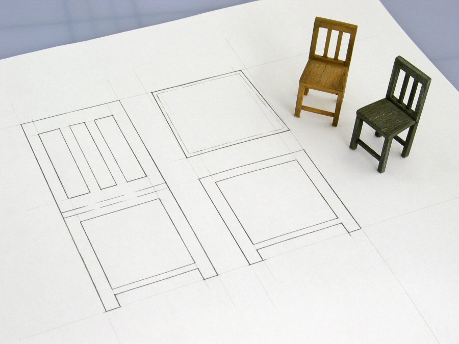
Inclusion of scale figures
Again, this is not a necessity but one can choose to include a figure to represent scale and it is well worth it in some instances i.e. showing clearance under overhead walkways or stair units. Obviously if a figure drawing, in whatever style, is included the most important thing is that it represents an ‘average’ in terms of size. According to the US publication Interior Graphic Standards the current height average is 1.75m for a male, 1.63m for a female.
Inclusion of isometric or perspective drawings is not a common practice, but they can enhance the drawing’s effectiveness and appeal .. it can make what is being represented much clearer, sometimes dispelling confusion and preventing error! A simple perspective representation is nowadays very quickly achievable using SketchUp, and this can be printed out and traced onto the drawing. See ‘Some of the principles of technical drawing simply illustrated – Part 1’ for an example of the use of this.
TEXT
i.e. anything on the drawing which needs to be expressed in words as opposed to numbers, using where possible regular ‘everyday’ words rather than jargon to convey information.
All writing should be in straightforward capitals.
Title block or ‘title box’ containing production title, drawing title (if not prominently elsewhere on the drawing), name of designer (production designer, art director), drawn by, date (or dates), drawing number in the series (i.e, ‘Drawing 1 of 5’), principle scale (other scales may be indicated next to part of drawing). The title block is often consistently in same place (usually lower right corner) so that it can always be looked for there, and so that it’s visible when sheet is folded in the standard way. If there are lots of sheets, it may be worthwhile to design ‘sheet number’ to read larger, so that it can be more immediately seen.
Lettering style
Really the only important objective in terms of lettering method is that the words are easily readable. Anything that conflicts with this is a mistake. Anything that takes too long to create is also .. realistically speaking .. a mistake.
Rather than spend so much time mapping out guidelines etc. for the even shape and spacing of lettering why not print out the words or sentences you have to include in a clear, simple and enlarged font, place underneath the sheet and traced from. There are good quality plastic stencils available for smaller lettering i.e. for technical notes and writing dimensions.
Supporting information
Notes can be very important, but it needs to be left to basic common sense in deciding whether a note is necessary. Writing them can take a long time especially if a stencil is used and too many notes can obscure a drawing. Sometimes an area underneath the title block is reserved for general written notes, sometimes areas next to separate views .. whichever may be better i.e. less cluttered.
Title block see ‘Text’
TOOLS
See also ‘Drawing board’, which is the main ‘tool’
Eraser
Soft white type best when working in pencil. ‘Putty rubbers’ are particularly recommended when working in pencil on tracing paper, though the rubbers themselves may be harder to keep clean.
Ink pens
There is nowadays less need for drawing in ink because reprographic processes are much better at recording pencil lines clearly! However, if you love ink .. Rotring pens can be the most satisfying option, although they are expensive and need an awful lot more maintenance than Rotring says! My feeling is that the far cheaper and easier ‘fibre-tip’ drawing pens always look a bit fuzzy and the lines are weaker.
Using ink at least removes any doubt as to whether, however thin, a line will be picked up by the copier.
A common problem when working with ink pens (though not so much with the fibre tip) is the ink being drawn underneath the edge of the ruler (or set square, or French curve etc.) if the nib is placed too close. For this purpose good rulers or set squares often have at least one edge which is ridged to prevent this, but it never completely eliminates having to be careful.
Rotring pens do not give any problems if they are used regularly .. i.e. at least every week. However, if they are left for months the chances are that the ink which remains in the ‘hypodermic’ like nibs will dry to the extent that the only option is to replace the nib, and unfortunately this is almost as expensive as buying the whole pen!
Masking tape
Recommended for taping sheet to board rather than ‘sellotape’ which can be difficult to detach from the paper without tearing it.
Pencils
HB standard, H for fine detail lines (even up to 3H), B-2B for heavier lines. 0.5mm thickness also standard. Mechanical pencils are always better because they give a constant line width and the cheapest ones are adequate (except that many of the cheapest sold in multi-packs have a 0.7mm lead which I think is a little too thick for detail work.
I also like using a 0.3mm pencil for even greater accuracy and line-variety, but these are only available as £4-5 versions.
Pencil retains the ‘hand’ quality, more versatile, more character; infinitely easier to alter/erase;
Scale ruler
Think of the scale ruler as just a miniaturized tape measure .. as simple as that! I strongly recommend the colour-coded ‘triangular’ type, especially those with just one scale per edge .. much easier to read! This type of ruler (i.e. the triangular) will also rest better on the parallel bar. A common mistake made when using the 1:25 scale is to misread the very smallest divisions as representing ‘1cm’ each, when they represent 2cm. See also ‘Working in scale’ in the ‘Methods’ section
Set-square
A large set-square (transparent plastic triangle) is essential in combination with a parallel bar or T-square and an adjustable one is also often essential. Can buy just the adjustable rather than both .. but you should know that the adjustable ones are made of a much heavier, thicker plastic. On the whole I’ve found it trickier to draw verticals with them and I need to take extra care that they don’t slip off the parallel bar.
Why are there 45 degree set squares and 60 degree ones? A ‘45’ can be used on the parallel bar to create diagonals in either direction (in addition to 90 degrees) and it sits more stable, but it doesn’t have as much vertical reach as the long side of a ‘60’. The ‘60’ can also be used for 30 degree angles, but not for 45 degrees.
Linex ‘College’ brand, clear light-brown tinted. Good weight and thickness .. not too heavy, not too light. Reasonably finished edges. The 45degree ‘36cm’ size is a good large average without being unwieldy, combining fairly good reach with stability (36cm is measure of longer diagonal side, as with tv monitors). £7.32 at LGC, hellermans.com £4.74 (£3.95 plus VAT), cheapest seen for £4.27 on eBay August 2014 (not inc. postage).
T-square
A long T-square is necessary if you’re using a plain board without parallel motion bar. If the board is on a stand which allows it to be placed jutting slightly over the table edge, the T-square can be used on all four edges of the board in other words for vertical lines as well as horizontal.
French Curves
Essential if you want to draw small, steady curves of the ‘irregular’ type i.e. curves which cannot be made with a compass. There are 3 distinct types of French curve and they come in packs, rarely single. The most useful ones I’ve used are from Herlitz because their edges have a central ridge, which means that they can be used for pen work without fear of the ink being drawn underneath if the nib is too close to the edge. This means they can be used from both sides which is an advantage when compositing curves. I didn’t find the Herlitz brand in a recent search, but the Linex College French Curve Set has similar edges (£3.99 Ryman online)
Paper stumps to smudge or even blend pencil (a specialist technique)
WORKING DRAWINGS
This is often the term used to refer to drawings done purely for the purposes of working out during the design process, including in other words ‘rough’ or ‘sketch’ drawings, as opposed to ‘finished’ or final drawings.
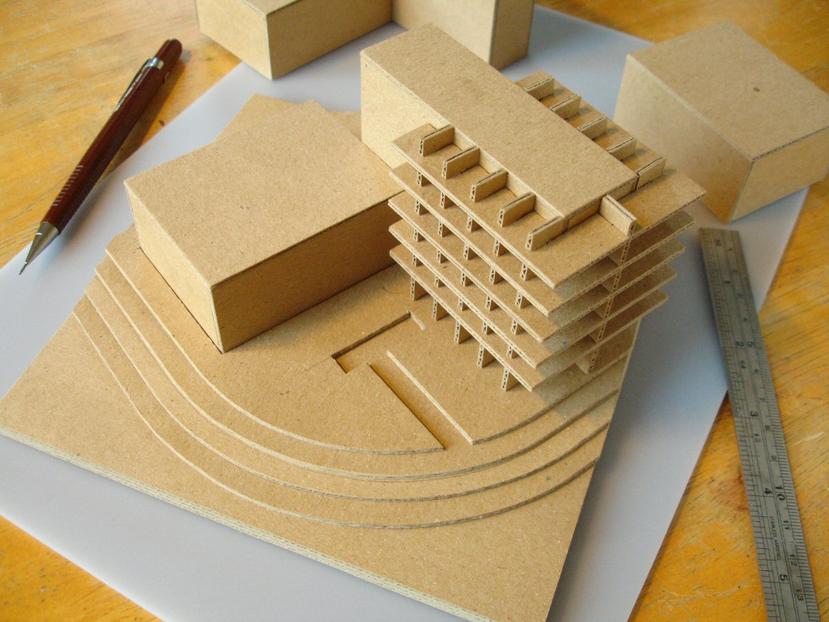
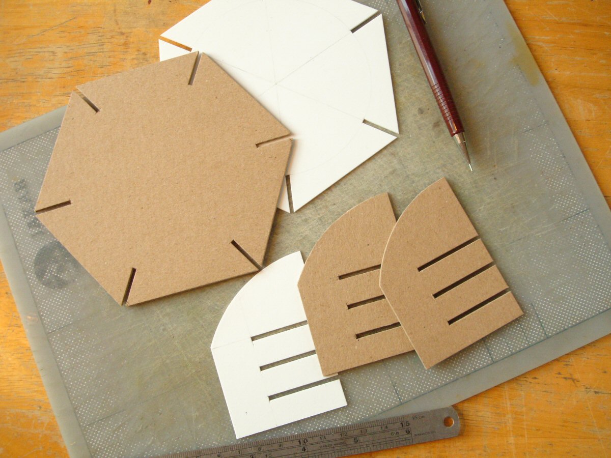
Just as the process of model-making often involves two phases .. one more exploratory, rough or sketch-like, for working out or developing ideas and the other ‘final’, perfected and complete .. the process of technical drawing can be similar. One difference though is that if the designer has chosen to explore and then perfect in model form first, the technical drawing may just be a straight transcription of information with little adjustment needed. On the other hand many designers, particularly when working to the often tighter deadlines of film and television, prefer to work foremost from the drawing board. Here it is common practice that whatever ‘models’ are produced actually come after the finalization of the technical drawings .. the so-called ‘white card models’ which are 3D pasted versions of the drawings themselves, to give a more identifiable spatial rendition of the set.
A strong word of caution about working solely from the drawing board! Many professional designers recommend it. How did they get to be ‘professsional’? .. over a length of time and through a great deal of hands-on experience. One needs a very practised familiarity with scale, proportion and real spatial relationships to be able to judge a spatial design purely on the basis of drawings. In my experience any beginner attempting this will just be pushing the ‘cart’ out .. entirely without the ‘horse’!
My recommendation, always, is to utilize both design tools .. drawing and model-making .. in conjunction from the outset. Even the roughest, quickest models will furnish a truer sense of space, while at the same time measured drawing is indispensable, for example working out stair units or rakes, or proportioning wood panelling.
SketchUp provides an excellent means of ‘modelling’ by drawing ..
WORKING PRACTICE
Being methodical
The first thing that books on technical drawing should tell you is that after you’ve got all the ‘knowledge’ or theory, and you’re familiar with the ‘rules’ etc. the most important resource while actually doing it is .. thinking a little bit like a ‘drawing machine’ .. thinking very methodically. What I mean is .. how a machine might manage tasks i.e. doing all of one task first then moving to the next. For example, wait until you’re ready to write in all of the final measurements then do it all at once. It makes sense to enforce a somewhat ‘blinkered’ mentality rather than ‘roaming’ around the drawing or flitting from one type of task to another.
Physical conditions
Comfort/posture (but not too much comfort, keeping mind awake); lighting and direction of light; organized/uncluttered space, remove anything not immediately needed .. helps with focus.
Unless you’ve got a particularly long worktable you’ll find that there’s not much side space left once an A1 drawing board is on it. It’ll save a lot of frustration to have a raised place (a trolley, platform, flat chair) to put all pens, geometry tools etc. in easy reach otherwise things get lost under drawing board and won’t stay on top of it.
Some prefer covering the board with a sheet of white paper, because the slight ‘give’ strengthens drawn line and pen work is not so ‘scratchy’.
Cheap (£shop) masking tape is probably best for securing drawings since it’s particularly low-tack, removable.
If working in ink on tracing paper, do not rest hand on paper because grease will prevent the ink from properly taking. Have either a piece of paper or set square underneath. There isn’t this problem working with pencil.
Never push a compass point into the drawing board. Two pieces of masking tape should be fixed underneath where the centre is on the drawing and this will be enough purchase for the compass point.
Adequate lighting, especially direction, can become very important! i.e. if right-handed, light coming from top and left.
Other drawing tips
Having a built-in familiarity with standard dimensions and proportions is of vital importance, but takes a while to acquire. In the meantime it’s usual to have scale figure drawing close by, or even one of a chair or similar familiar reference object.
When doing finished work in pencil and doing areas of heavy shading or hatching, these can easily become dusty with graphite particles and easy to smudge. A clever idea is actually to do these areas on the reverse side of the paper so that they’re protected, at least while drawing.