This is the final of five outline accounts dealing with what I consider to be the five defining areas of model-making work; main construction, fine construction, modelling/shaping, creating surfaces and painting. I’ve written these overviews in preparation for teaching sessions at RADA ( Royal Academy of Dramatic Art ) in London. So they’re tuned towards the specialities of theatre design model work, but most of the points will be relevant in general terms to model work in other disciplines. I’ve started with the general ‘themes’ or requirements of the subject, followed by more specific and practical guidance on the materials and methods which can be used.
I always start by thinking, at least for a brief moment, that there’s not much that I can say about painting! I think this is because I feel that painting is a highly personal thing .. everyone will have their own ways of going about it, and whatever one says about it each person will learn best from their own experiences. I think another reason is that although I’ve done a lot of painting, of various kinds over many years, I still feel like an outsider. Painting is still very much a ‘trial and error’ experience for me. Maybe that’s exactly what it should be .. in order to keep the experience alive and to stay alert!

In fact there’s an awful lot that can be said about painting in this context, if only when one considers the variety of materials one can use as paints .. a wide range of acrylics (‘heavy body’, ‘light body’, liquid or ink-like), gouache, watercolour, tempera or ‘poster’ paint, inks and stains, polishes, enamel paints, artists’ oil paints, spraypaints (DIY, graphic art or graffiti sprays), coloured pencils and pastels, wax-based rubbing paints .. and so on!
I like the term ‘model friendly’! I picked it up from somewhere along the way and it’s usually the first thing that comes to mind when I have to focus on the subject of painting models. So what is ‘model friendly’ painting? An ideal paint for model-making needs to be opaque enough to cover properly without streaking, but at the same time thin enough to do it without clogging fine detail; it needs to mix well, be easily thinned and easily removable from brushes; it should be inexpensive and readily available in a good range of colours; it needs to dry quickly and it helps if it’s self-sealing (so that it can be quickly worked over once touch-dry without dissolving); it also needs to be adhesive enough to stay on a variety of materials, including if possible plastic and metal, and strong enough once dry for light handling. My preference is also for a paint which is matt by default (if a glossy surface is needed this can be better achieved by varnishing a matt surface rather than having to use a separate gloss paint. This gives more control over the results). It also helps a lot if additives are available to extend its properties further i.e. to dilute it heavily without affecting its adhesion so that it can be used as a transparent glaze, or to slow the drying time so that it can be pushed around or wiped off, as oil paint can.
If such a single paint existed it would inspire feelings of much more than ‘friendship’ towards it .. unfortunately it doesn’t exist! But one can get all these things from using a combination of just a few. Acrylic paint comes close, but there are shortcomings and it depends a lot on the type, as I will explain later. The same applies to oil-based enamel paint (more properly called ‘cold enamel’, familiar as the small tinlets from Humbrol or Revell) .. this is an extremely ‘model friendly’ paint in many respects, but lacks versatility. What is not so often considered though is combining the two .. I don’t mean literally mixing, because they won’t, but using them over each other. Coloured pencil, pastel crayon, shoe polish, metallic waxes etc. can also be applied over either of these paints to modify the effect. Many of these combinations would not be open to a serious artist concerned with permanence, but are nevertheless sufficiently durable and lightfast in the shorter term.
GENERAL APPROACH
Observation and visual research
I won’t repeat what I’ve already said about the importance of starting with the right visual information and the need for interrogating the true ‘look’ of something before representing it .. just see the previous post on this subject.
One shouldn’t have to argue that it’s the duty of all who are involved in the creation of images of the world to have a good understanding of its true colours, regardless of how these might then be manipulated to support an idea. One should be fully aware for example that light skin is not simply ‘pink’; that concrete is not really ‘grey’, and that tree trunks are very rarely ‘brown’! Our sensitivity to these things is really not helped by our common language! Quite apart from such brutal distortions as describing people in terms of ‘white’ or ‘black’, we don’t have much of a vocabulary when it comes to the rest of the colour spectrum .. red, yellow, blue, green, orange, pink, brown and grey, that’s often about it for most people! I think this may be one of the reasons why children invariably start by painting tree-trunks brown and often continue to do so in later life .. when the child asks what colour they are, ‘brown’ is just the closest from a limited range of words to describe it.
Most often reaching an understanding of true colour is not simply a case of identifying just one but discovering the interplay of many. A brick wall for example, even the blandest of modern ones, is a subtle pattern of many related colours .. and the trick is to reflect this in a balanced and economical way. In the previous post on Creating surfaces I talk about identifying the essentials of a look or a natural pattern .. seeing the visual recipe .. and conveying that in the model. At such a small scale it’s usually not possible to include everything that the real-life surface contains and it shouldn’t anyway because it is after all an artifice! The small scale forces the designer to concentrate on the few most relevant essentials and the model is the best vehicle for testing what will work.
Planning for painting
Don’t leave painting to the last! This may seem like a funny thing to say, because one would assume that the other processes involved in the making of something all have to come first! Of course they do, when we’re talking about individual elements, but a theatre design model may be composed of hundreds of different elements nearing completion at different times. It may seem logical, even sensible, to complete all the preceding steps on all of these until there’s nothing left but to concentrate on the painting .. but I think this could be a big mistake! There’s an advantage to finishing some of these elements ahead of time just to give yourself an idea of the final look .. whether that turns out how you thought, or whether it prompts a rethink. Also, unless final painting is mundanely straightforward, it is difficult to predict how long it will take to get the desired effect so the sooner one can start investigating the better. A set design is a composition which is no less visually involved or precisely balanced than a painting! I don’t know of any painter who would construct all the elements of a painting in precise detail as a complete drawing and then leave all the colouring-in to last! One needs to preview a great deal as one goes along, for example how colours and surface qualities change forms and react with each other. Often starting the painting process sooner alleviates stress .. for example when discovering that the material chosen for surfacing actually needs very little painting or that the surface texture created does most of the painting work on its own when it’s dry-brushed.

While elements of the model are being made it’s necessary to keep a constant question going in one’s mind as to how they’re going to be surfaced .. whether they’ll be given just a flat colour which can be easily applied once assembled, or whether the different treatment of parts means that it’s better to keep them separate till the last, as above.
However, even if you try hard to paint as you go, it’s often a ‘sod’s law’ inevitability that much of the final painting is done in a rush, because most of the preceding stages take longer than planned, and this is often made worse by not even ‘kitting out’ for painting properly beforehand. By this I mean a number of common sense things .. making sure that reference images are organized and visible; making sure that you have all the paints, additives, brushes and other tools you are likely to need including any specials such as stains or metallics; having scraps of the materials you have used to make tests on; uncluttering the workspace, making sure that it is clean and comfortable; making sure that there is a continuity of reliable, neutral light well into the night!
The composition of paint
It’s very worthwhile knowing at least a little about what goes into a paint! This not only helps with how to use them but also how to change or extend them. Basically paint is composed of .. a mineral or chemical pigment which provides the colour and is usually very finely ground; a solvent such as water, acetone or turpentine which carries the pigment particles and which, upon evaporating, causes the paint to dry; and a binder, in other words a glue, which makes the paint stick to a surface and then hardens to make it durable.
The pigment is not ‘dissolved’ in the solvent but suspended in the form of fine particles and these will differ in shape according to the different minerals or chemicals used. The opacity of a paint, i.e. how well it will cover without lighter streaks showing through, is as much dependent on the shape of those pigment particles as anything else. For example jagged particles are likely to clump together whereas smoother particles will stay apart. For this reason certain colours will usually cover more evenly than others, regardless of the type of paint. Earth colours for example always cover well, whereas some reds or blues are invariably streaky. To compensate for this and to even out the differences a fourth ingredient is commonly present in paints .. a filler. This is also a finely ground powder, but one which is itself colourless and chemically inert. Chalk is commonly used as a filler in gouache, alumina hydrate is another often added to acrylics, and others include marble dust, kaolin, silica and talc. Some more modern, synthesized pigments such as pthalocyanine are so intense that fillers are essential to tone them down and make them ‘palatable’. Gouache is a form of watercolour with a high proportion of filler added to make it especially opaque. But on the other hand fillers are most often added just to extend the paint volume and make it cheaper to produce. It stands to reason that cheaper paints will have an excess of cheap filler, resulting in colours that are rather dulled. This may not be so obvious at first judging by the colour squeezed out from the tube, but it may not keep that colour on drying and the lack of pigment intensity can become very apparent when mixing two of these colours together!
In many paints the solvent which carries the pigment is the same as the solvent in the binder .. for example in most regular, brush-on acrylics it is water. The paint dries and hardens as both evaporate. So why does the pigment need to be ‘wetted’ with the solvent separately? .. can’t it just be added to the binder in one go? If you’ve ever tried to mix your own paint, for example by adding Pva glue to powder pigment, you’ll know that it’s much easier to integrate the dry pigment with the glue if the pigment is made into a wet paste first. The water serves as a bridge between the two and helps prevent pigment particles from clumping together.
The binder, which is essential to provide both adhesion, sealing and eventual hardening, is what principally differentiates paints from each other. The binder in most regular acrylic paints is an acrylic polymer (it doesn’t mater so much here what is meant by that, but if you want to know find the entry in my Lexicon above). In artist’s oil paints the binder is commonly linseed oil; in gouache and some watercolours it is traditionally a very small amount of gum arabic, and traditional tempera paints were commonly made using egg yolk, sometimes animal glue or honey. It is mainly the binder .. or rather the extent to which the binder is modified .. which determines whether a paint will dry matt, silky or ‘eggshell’, or glossy. But it can also depend on the granular size of the solid ingredients, since even minutely rougher surfaces will appear more matt because the light reflected from them is broken up in various directions. Less finely ground pigments may make the paint more matt or a higher proportion of filler in a paint will ‘absorb’ much of the shine in this way (though at the same time diminishing the colour intensity). Sometimes a small proportion of wax is added to paints as a matting agent.
Knowing these things means that you might, to a certain extent, be able to change the paints you have .. perhaps by adding more glue to make the paint stick better or dry harder, or adding more filler i.e. chalk dust or talc, to make it more opaque or matt. Some additions may react with certain ingredients of the paint and make it unusable i.e. making it too thick or preventing it from hardening .. but it’s worth a try and you might even improve it!
Colours
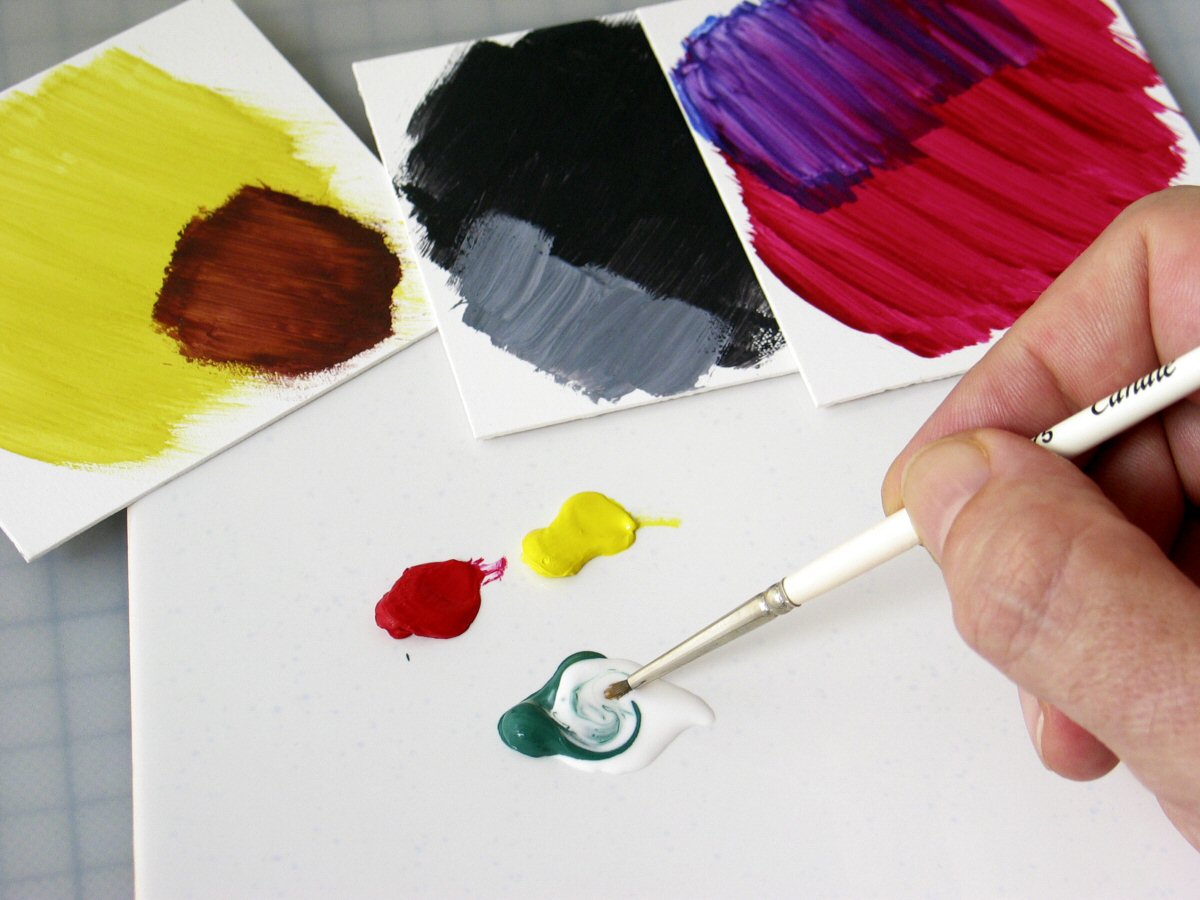
Whatever paints you use, it’s important to be able to get any colour you might want .. its vibrancy, hue, lightness or shade .. as easily as possible. Control over colour begins with having at least a good basic collection of essential colours plus white .. and let’s also include black for the moment for convenience .. and I deal with choosing colours later in this section. But it also depends on being familiar with other individual properties of the paints you have. For example there will be quite a variation in the properties of different colours within the same range from the same manufacturer .. some will be more opaque than others; some will thin more evenly; the pigment in some will be more concentrated and dominant than others; some (especially in the case of acrylic) will dry glossier than others! So getting the green you want is not necessarily just a case of mixing the right yellow with the right blue for example. I only started doing the following once I’d amassed too many paints to choose from at a glance, but I wish I’d started much earlier .. making paint swatches! I originally started making them purely because one only gets a generalised idea of the colour from its packaging, but then found that this could tell me a lot more besides about the behaviour of each paint compared to another.

I’ve made this kind of test, shown above, with every paint and every colour I have .. brushing each in its strongest undiluted form for about a third of the way down but then thinning it carefully to get a fade to almost nothing. It’s important not to labour getting an even fade but to go with what the paint does naturally so that if the paint is, for example, difficult to graduate the swatch will reflect this. I’ve used pieces of oil-painting paper to paint on, because this type of primed surface is a good ‘average’ .. neither too absorbent, nor too resistant .. and it’s very pleasant to paint on, whether in oil-based, spirit-based or water-based paints. These give me an instant visual record of how well the paint covers, how the consistency changes when diluted and how matt it will dry. Some colours will even change in hue when thinned and this is important to know before using them. For example there are rich reds which appear fairly neutral when seen at their full strength but which reveal a strong bluish bias when thinned or mixed with white (more on colour undertones later). Or there are even colours composed of more than one pigment where these start to separate when thinned such as the chocolate brown below. This contained some strong pthalo green which is appearing towards the bottom of the sample.

Nothing replaces having to experiment with colour mixes on-the-spot i.e. when you need them, but looking through these swatches has always helped me to define the colour I want and make better choices as to how to achieve it. But it’s also a fact that having to mix colours from scratch each time one comes to painting is tedious! .. and we all have favourites that we use time after time. I mix up large amounts of favourite colours when I’m in that kind of mood and (since I prefer using acrylics which are more liquid) fill flip-top dropper bottles of the type shown below. This is the most convenient and economical way to dose out paint, in very small amounts if need be. Often I’ll re-use the old bottles from bought paint but £shops also sell ‘travelling bags’ containing bottles of shampoo, shower gel etc .. the cheapest paint bottles around at 4-5 for £1!

We’re probably all familiar with the basic theory .. that one should be able to get any colour hue one wants using just the three primaries, red, yellow and blue, with the addition of white to lighten the tint (hue by the way means colour, tint means the colour mixed with white and shade is the colour mixed with black). You may also have picked up the advice that one shouldn’t need a black .. that a sufficiently ‘black looking’ colour can be made from a combination of the three primaries. Anyone who’s tried to find those three magically pure, neutral and equally strong primaries amongst the range of existent paints will know .. it just doesn’t work like that in practice! There are vibrant reds that feel closer to orange, while others will feel closer to purple. The same is true of blues .. either they’re too dark to judge in the shop, or they feel closer to either purple on the one side or green on the other. I think a lot of people think that they’re at least on safe and neutral ground in choosing a strong yellow .. but even here there’s likely to be a subtle bias towards either orange or green.
You might ask .. do these subtle biases matter that much? If we’re going to mix colours together, can’t we eliminate the biases anyway? The fact is .. no we can’t, if we’ve just got those three paint colours to work with. Imagine for example that you’ve chosen a red which was the most vibrant you could find, but it’s just a tiny bit on the purple side .. in other words towards blue. You want more of a pillar-box red but just as vibrant, so you add some yellow to it. The resulting colour is duller than you expected it to be. At that point you might remember another piece of the theory .. that complementary colours (those opposite each other on the virtual colour wheel, see below) actually cancel each other out, producing a form of grey. This is what has happened between your yellow and the trace of blue in your red .. and there’s nothing you can do about it! Actually the opposite of blue is, strictly speaking, orange but a warm yellow can be close enough to it. It doesn’t even help if the yellow you’ve got is one that tends towards green instead .. in this case the green and the red being opposites will also dull each other! It’s not usually possible to make colours brighter (i.e. not just lighter but stronger in chroma, to use another accepted term) by mixing them and most often it’s the opposite. If for example you want to make the brightest possible green from blue and yellow you have to combine a blue which already has a green bias with a yellow which also has a green bias. If you then want to lighten it without losing colour brightness or ‘chroma’ you add more yellow, or if you want to lighten it and tone down the brightness you add white.

Then there’s the theory that a good black can be obtained from a combination of primaries. If you choose those three primaries according to their visible brightness then this probably isn’t going to happen .. you may get a form of dark grey at the most! To obtain a convincing black you need quite darkly biased versions of those primaries .. a rich Prussian blue and a dark magenta for example.
The simple answer seems to be .. if you’re not so concerned about vibrancy of colour, and 100% control in achieving every nuance of colour possible, then you could well be satisfied with the three closest possible primaries, plus white .. and yes, why not, including a black just to make life easier! Many paint manufacturer’s websites contain advice on the best three colours to choose if you have to, such as the following from Winsor & Newton:
Here the company recommends for example using it’s ‘lemon yellow’, ‘Winsor blue’ and ‘Permanent rose’ when working with its Galeria acrylic range because these it says are closest to the printing process colours .. yellow, cyan and magenta.
If on the other hand you’d like more control over colour, you will need at least two versions of each primary, plus a few others besides according to personal preferences. My own personal preferences are as follows:
Red cadmium red medium (yellow bias) and quinacridone red or permanent alizarin crimson (blue bias)
Blue pthalo blue (green bias) and ultramarine (red bias)
Yellow cadmium yellow medium (red bias) and Hansa yellow or lemon yellow (green bias)
I also rely fairly heavily on having others which may not be strictly necessary but which I’ve got used to using anyway .. pthalo green (a very strong, vibrant green with a blue tinge), yellow ochre (an essential basis for naturalism), raw umber (a rich dirt colour), red oxide (or a rich terracotta i.e. a convincing brick-red), Prussian blue (mainly for making black or for darkening greens).
Here I’ve tried to use just universal or accepted colour names in this list .. rather than others like the ‘Winsor blue’ for example because the chances are that they will be fairly similar amongst different manufacturers. But unfortunately there’s no 100% guarantee, even when the standardised pigment identification CII (Colour Index International) number is the same! What all this boils down to really is how I began this section .. for the most reliable control over colour you need to make swatches of the colours you have, identify which are strong pigments and which are weak, practise mixing and build on your own personal experience.
Using ‘natural’ accident
It’s very difficult to create a natural, convincingly random effect by deliberate means! Strictly speaking it’s impossible! .. and in any case one could argue that when the eye of the designer is involved it’s not going to be truly random anyway because there will be a fairly strong element of selection and personal preference, and the urge towards aesthetic balance that true nature doesn’t always care about. However, it’s often necessary to create the semblance of randomness, and for this it’s usually better to discard the brush, using other things such as crumpled tissues or natural sponges to dab paint on .. anything in fact which defies complete control. Making textures do the painting .. i.e. stippling polyfilla to make a rough surface and either dry-brushing or thin-washing over it to bring that texture out .. is good in this respect because there are always some surprises, elements that weren’t planned. I like creating paint effects by spraying though something else such as scattered granules or torn netting (see Creative spraying further on) because it increases the element of chance.
Waiting for paint to dry
I’ve included this as a ‘general’ point because I think there’s a lot of confusion about how long different paints need to dry and harden thoroughly. Many paints become touch-dry very quickly but this doesn’t necessarily mean that they are ready for anything! For example a very thin coat of acrylic paint may be dry enough to over-paint safely in under a minute but the complete hardening of the paint to attain its full strength and adhesion to the surface will take days! In fact, acrylic paint can be particularly misleading because thicker coats will quickly develop a skin (especially annoying when they are still on the mixing palette) while underneath the paint can remain soft and damageable for weeks! The same goes for the matt enamel paints featured later .. they can also be dry to the touch in a matter of minutes but will remain very susceptible to handling until they’ve had a full 24 hours to dry completely. These enamels dry differently from acrylics .. they dry from within and do not form a skin, hence the fact that although initial touch-drying can take longer, complete drying is generally quicker.
PRACTICAL GUIDANCE
Priming surfaces
We’ve looked at the importance of this as a safeguard against warping in the previous post on Creating surfaces. But that’s not the only reason why priming (i.e. painting or spraying an undercoat) is important. Acrylic paint is often favoured because it will take to a variety of surfaces and dry properly on them without those surfaces needing any special preparation. This is generally true .. but there are times when even acrylic needs some assistance with covering evenly. Some acrylics (if they have a strong binder) don’t necessarily need an absorbent surface and will even stay on plastic, but most often the smoother and less absorbent the surface the ‘streakier’ the brushstrokes will be. The paint covers but it’s almost impossible to get it to cover evenly. This is partly down to the individual properties of the paint .. there are pigments which are more opaque than others and there are paints which are designed to be more opaque, as I’ve said. But even coverage is also dependant on the structure of the surface being painted. A good example is provided by canvas which, even today, is still largely unquestioned as the best possible painting surface. It’s texture traps paint and the regular weave tends to portion it evenly. In painterly terms this is often referred to as the tooth of the surface, and the oil-painting paper I use for colour swatches has a regularised tooth. Gesso which is for priming canvas or underpainting in white has a slightly rough tooth, though much less visible, which helps to anchor the paint more evenly.
Although paint will take better to absorbent surfaces it also sometimes makes sense to make those surfaces somewhat less absorbent, another reason for priming. This means that paint can be more easily moved around or sometimes even fully removed rather than immediately soaking into the surface (see later Staining, tinting and varnishing and the use of semi-absorbent oil paper). Some oil-based paints fail to dry properly if the ground is too absorbent because it soaks up the oil too quickly, leaving the pigment as a powder on the surface.
Working with acrylic paints
Acrylic paints seem to be the ‘default’ choice of theatre designers for their models .. tube acrylic paints, that is .. particularly amongst students or beginners. When I go to teach 1st-year theatre design students I see boxes of them everywhere and, understandably, these are often the ‘discount’ or cheaper kind. I’m afraid to say that I personally don’t get on very well with tube acrylic paints and from the look of many of the results .. neither do they! I find it much too thick, and difficult to thin down evenly; I’m happy for it to dry fairly quickly on the piece I’m painting but annoyed that it does the same on the mixing palette .. but more annoying is the silkiness or even glossiness that remains after drying which is usually inappropriate to what I’m painting!
Some types of acrylic paint are much more ‘model friendly’ than others. For example I like painting with the bottle acrylics found in many craft/hobby shops because these are generally thinner, more opaque, more matt, longer lasting and much easier to dose out. The ‘Americana’ or the ‘Crafters’ range from DecoArt, below, are the best I’ve found in these respects. They must have a good binder, because generally I’ve found they will fix well onto most things, even foamed Pvc if it’s lightly sanded, and when dry they are sufficiently hard-wearing.

Apart from their good performance, I like their handy, tight-sealing, flip-top style which keeps them remarkably well and allows me to dose single droplets if needed! This is a big plus in terms of comfort! On the downside, the colour range is certainly not as good as most other ‘artist’s’ acrylics and the shops which sell them don’t tend to stock the full range or keep it stocked anyway. I wouldn’t use them if I wanted complete colour freedom or vibrancy .. but I often rely on them for my usual ‘naturalism’ palette. They’re not expensive .. the common price for a while now seems to be £1.99 for 60ml.
There are other acrylic brands in similar bottles, and some of these work just as well but some do not. The ‘Inscribe’ range is good, as is the ‘Folkart’ and ‘Anita’s’ .. I haven’t tried them all! The £shop-like chain ‘The Works’ stocks some useful things from the ‘Royal & Langnickel’ brand including their bottled acrylic paints. Some of these may be usable, but the darker colours I’ve tried were very streaky (i.e. too transparent) and they dried almost gloss!
An excellent form of acrylic paint in just about all the respects I’ve mentioned is the SuperSaturated scenic paint from Rosco. This is concentrated, and pigment strengths are fairly well-balanced. 1 litre bought will make 2 litres of strong, opaque paint and it mixes readily with water. It contains a very strong binder and it’s claimed that this is strong enough to stay put on plastics and metals (though in practice these surfaces need to be roughened at least). Good coverage can be achieved thinly and it dries very nicely matt! Unfortunately it’s anything but cheap! It’s normally only available in the 1 litre pots and these can cost between £12 and £25 each. There’s a tester box available which is very useful, shown below but this costs around £50. However, if you’re on friendly terms with a scenic workshop that uses these paints you won’t regret filling some sample bottles!

Acrylic owes a lot of its popularity to the fact that it dries so quickly, meaning that relatively little time is wasted between coats. But this also means that acrylic can’t be manipulated, especially blended, with the same ease as oil paint which remains workable for a great deal longer. It also means that it’s difficult to use textured applicators such as sponges to distribute the paint before it dries on them. For these reasons manufacturers of artists’ acrylics sell what they call retarders which can be added to the paint to slow the drying time. The retarder medium also becomes a perfect vehicle for making the paint more transparent, as a form of glaze, if enough of it is used. I use the retarder for acrylics from Winsor & Newton, which seems to work with all types of acrylic I’ve tried. Below I’ve mixed quite a high proportion of retarder to paint and used natural sponges, crumpled tissue, newspaper or rags to distribute it over paper. It remained workable .. i.e. movable or removable .. for about 15 mins.

Working with gouache
I see almost as many boxes labelled ‘gouache’ in theatre design studios. Gouache is basically a modified form of watercolour, with a filler such as chalk or talc added to make it more opaque (hence it covers evenly) and usually a little glycerine to help it brush or ‘flow’ better. Like watercolour it contains only the minimal amount of binder needed to hold it together because after all, it’s meant to be used on a properly absorbent surface such as paper and it’s not meant to be touched afterwards. It can’t be over-painted easily without re-dissolving what’s underneath .. but this does mean that some nice blending is possible. It’s also agreeably matt! Another difference to acrylic is that whereas light gouache dries a little darker, dark will dry a little lighter.
Because it has very little binder in it, it is neither sticky nor durable. So if for example you paint a modelled figure with it, it may have just enough cohesion to stay on the surface and dry there but it will fairly readily come off. However, gouache can be very easily modified just by adding a little water-based glue. I usually mix in roughly the same amount of Pva wood glue to gouache on the palette. I’ve had good results with this .. even taking on, and staying on, plastic. If you’re careful with the proportion of Pva used it shouldn’t change the matt quality of the paint too much, but it will change the covering properties i.e. it will make it more transparent and therefore a little streaky.
Working with enamel paints
The term ‘enamel’, when applied generally to a paint, is supposed to denote that it will be particularly hard-wearing, but it should not be confused with the ‘enamel’ finish given to metalware which is much harder because it is fused on using heat. ‘Cold enamel’ paints are commonly available in gloss finish but can also be found in ‘satin’ finish or matt. They are also commonly oil or spirit-based rather than water-based. Generally the matt versions are suitable for painting straight onto absorbent surfaces such as regular paper or card and will dry properly there (unlike oil paint). The added advantage is that the paint will not warp even the thinnest paper, unlike any water-based paint.

The enamel paints sold in modelshops (mainly for painting plastic kits) are good examples. Both brands, Humbrol and Revell, use otherwise identical tins and a similar range of colours. The Revell enamels tend to be a little thicker .. there are strong devotees of one or the other. The same distinction between ‘tough dry’ and ‘properly dry’ applies to these enamel paints. Matt Humbrol paints will be touch dry almost as quickly as acrylic, sometimes within 15mins, but it will be a further 24hrs at least before the paint is durable. Humbrol enamel paints cover exceptionally well (with much less streaking than acrylic) and dry very thinly so fine detail does not get clogged. The oil in them will rise to the surface in the tin if they are left for a long time and this means that they can have a very long shelf-life if the tin is properly closed. As a disadvantage it means that they need to be thoroughly stirred if left for a long time as the pigment and filler has separated to the bottom. They also have, like regular oil paint, a very pervasive smell, and although there are no serious health risks with good ventilation I have experienced occasional headaches and smarting eyes after working with them for more than a few hours!
The tins may look small but what they contain goes a very long way because often full, opaque coverage can be achieved with a very thin layer and the paint can be eked out with the brush to cover a very large surface without losing opacity. I would guess that a 14ml tinlet has easily the same covering reach as a 60ml bottle of acrylic for example. Both Humbrol and Revell tinlets are widely available in shops (those selling artists’ materials, hobby or craft shops, or those dealing with scale model building) and are relatively inexpensive though prices vary from one shop to another. For example the best deals are online at www.wonderlandmodels.com with tins around £1.36 including VAT whereas in shops they range from £1.50 to £1.80.
Although I’ve always been a devotee of these paints for whatever purpose, mainly because of their extraordinary adhesion and toughness, there are definite drawbacks apart from the smell! They’re designed for simple, flat coverage rather than ‘painterly’ painting i.e. there’s little blending possible and no additives such as retarders or glaze mediums available. On the other hand they adhere strongly even if heavily thinned with white spirit and can make very effective wood stains. There’s quite a good range of colours, though this is far better weighted in favour of earth colours or natural greens than strong primaries.
Tempera
The type of ‘tempera’ familiar to most people from school days comes in two forms; large plastic bottles and hard, round ‘cakes’. Both are relatively cheap, and certainly not the best pigment quality, but they can still be very useful! At around £2.00 on average for a 500ml bottle of Reeves Redimix Tempera there are at least some colours within the limited range which could serve as excellent basecoats especially for large areas. This type of tempera is also soft compared to most acrylics so it is ideal for the topcoat paint layer which has to separate easily when using craquelure medium for special paint effects. Whereas the liquid tempera appears to have a reasonable amount of binder the ‘cake’ version doesn’t so it behaves more like a cheap, solid gouache which can be wetted ‘on the cake’ where none is wasted. In UK art shops cake tempera is not a common sight apart from the children’s’ painting kits but in some other countries they have a more prominent place in art shops and there is a much more serious colour range.
The most useful brushes to have
You’ll notice from the photographs in this article that there aren’t any fine and expensive sables here! Painting brushes aren’t designed to be rubbed against scratchy surfaces or poked into tight corners, let alone used like a plunger for stippling! So there’s no point in buying expensive brushes! Synthetic brushes such as the one shown on the far right below (usually white or tan-coloured nylon or ‘Prolene’) are the most hard-wearing for this kind of work and they keep their shape well. They are not usually expensive and it’s worth having a few different types i.e. a couple of extra-fine detail brushes (’00’ or smaller), a couple of larger round ones and a few flat. The flat ones are the best to use for streak-free painting of larger areas but they are also good for dry-brushing.

It’s also useful to have some general-purpose hogshair brushes (such as the one on the left above) for thicker, textural painting especially stippling. These brushes are also better for forcing paint into tight detail such as the mortar lines inscribed in Kapa-line foam when making brickwork. A third useful type is the full, soft kind shown in the centre (in this case a calligraphy brush) because these are the best for loading when applying washes of watery paint.
Caring for brushes properly is almost as important as having them in the first place i.e. obviously they should never be left for long after painting before cleaning them. Even then, cleaning is not just a matter of rinsing them out thoroughly in the water used while painting. This will get rid of most of the obvious paint but (especially with acrylics) there will always be some which has crept up to the metal sheath (the ferrule) which is harder to remove. This will continue to collect after each use, the hairs will gradually be pushed apart and the brush will never close neatly when loaded with paint like it used to. The solution is to wash it more thoroughly in warm, soapy water after each use, using a stronger bristle brush or even a wire brush carefully to infiltrate the tight bundle of hairs at its base. It’s also worth periodically reviving brushes by doing the same using a stronger brush cleaner or more forceful soap such as ‘The Master’s’ Artist’s Hand Soap.
After brushes, the next most important piece of equipment for painting is a mixing palette or at least some kind of non-absorbent surface on which paint can be mixed and which is easy to clean afterwards. I mostly use flat, white kitchen tiles because these can be left and the paint scraped away once dry without damaging them. Occasionally a flat surface is not suitable if more than just a little paint needs to be mixed up to cover a larger area, especially if this needs to be kept for a while. Of course things like yoghurt pots will serve but I’ve found there’s more need for smaller vessels. The customised mixing palette below is a sheet of 5mm foamed Pvc plastic, light but stable, and makes use of plastic milk-bottle tops glued to the surface to hold larger amounts of paint. I’ve also included a pad of washable plastazote foam to wipe brushes on.

Basecoating and working ‘light to dark’ or ‘dark to light’
If an element of the model has been made from more than one material but will be given the same surface treatment it makes sense to paint on a unifying coat first. Dependent on the effect one wants one can start from a pale or white base and paint conventionally from light to dark, or alternatively the basecoat can be dark with further colours applied, especially if dry-brushing, from dark to lighter.
Paint can be applied to a white, or light foundation in various ways. If the paint has a fairly strong, quick-drying and ‘self-sealing’ binder (meaning that once dry the paint layer will not be dissolved by further paint applied over it) it is usually possible to apply the paint as it comes to achieve a solid and even colour. This is true of most acrylic or wall emulsion paints for example. But these paints can often be thinned down considerably and applied as washes, which should still seal themselves, so that other or darker colour washes can be applied on top with the initial colours still showing through. This is sometimes referred to as a type of glazing. By this means it is usual to build up effects gradually from light to dark. Watercolour paint and gouache are non-sealing because they contain the minimum of binder and are normally only used for painting on a suitably absorbent surface, such as paper, which goes some way in fixing them. They can be used in the same way (as above) for building up rich colours on suitably primed surfaces but preceding colours will always mix through and the contrast may be limited. Watercolour is transparent, because it generally doesn’t contain fillers, whereas gouache is opaque because it does. Acrylic is the best in terms of giving the versatility of working in very thin coats but gradually increasing colour richness, depth and contrast. With acrylic it is difficult to go back to white though i.e. to start again and repaint areas without it being noticeable or mudding the look.
An alternative is laying down a dark colour first (or starting earlier with a dark priming coat) and applying progressively lighter colours on top of it .. working from dark to light. This doesn’t work very well with transparent paints or glazes; it is most effective using opaque acrylic, gouache or matt enamel. This is especially when there is an under-lying texture which will automatically pick up most of the colour on its raised parts, revealing the structure more (as in brass rubbing). This technique is known as dry brushing. This involves putting only a small amount of paint on the brush (similar to blusher on a makeup brush), so it is not literally ‘dry’ but certainly minimal, and lightly skimming the surface. It can be used to subtly alter or enhance colour on a light ground but it is usually much more effective when applying lighter opaque tones over a dark ground. It’s also easier to paint over mistakes with more of the basecoat colour and start again without betraying the fact. Dry-brushing tends to give an enhanced, more dramatic look because of the increased contrasts .. as if glancing light is casting stronger shadows.

For example, above, I am skimming over the relatively prominent brick structure on this piece of black foamboard using a partially loaded brush and thin but opaque acrylic. The main object is that the mortar lines and other indentations remain darker. For the more subtle floor surface being painted below a ‘drier’ application of paint is needed to give full effect to the minute variations in the texture.

An even more delicate ‘dusting’ of paint was needed to bring out the raised pattern on the piece of kitchen tissue used to simulate this quilt and to suggest wear on the old leather Chesterfield.

Naturalistic painting can be likened to a performance by a highly skilled actor. It can be so convincing that it feels somehow effortless and spontaneously generated .. belying the layers of thought and preparation that have gone into it!

For this wall piece using Kapa-line foam (a teaching example, hence left unfinished) I have base-coated in a sandy mortar colour instead of a dark one, so that this will remain visible in the inscribed lines. I used thinned acrylic and worked it into the surface with a hogshair brush. This was followed by randomised touches of two more colours shown below. It already looks fairly convincing as brick, but more like brick which has been sand-blasted .. too clean and evenly coloured.

So the final touch was using a wash of thinner, darker colour, concentrating on where the bricks are more deeply worn away, where grime would mostly collect. If this wall were in a proper model setting there would be more of this at the bottom, dirtying the meeting between wall and ground.

Staining, tinting and varnishing
I’ve briefly touched upon the use of wood stains in the previous post on creating surfaces. Wood stains of various shades simulating various types of wood can be found in stores such as B&Q, and on the whole the spirit-based type are best because they infiltrate the wood fibres better giving a richer effect. But these can be expensive especially if only a little is needed and good stains or tints can also be made by mixing a little pencil or pastel pigment with white spirit, or thinning down enamel paint as also suggested. Liquid shoe polishes are also cheap and are effective either for staining wood or glazing other surfaces. The pieces of stencil card below were given a grain using sandpaper and then stained variously with transparent acrylic, bought wood stain, pastel/white spirit or liquid shoe polish.

Below are texture samples made with Polycell ‘Fine Surface’ Polyfilla which have been rubbed lightly at one end with coloured pencils, then wetted with a little white spirit. The pencil pigment blooms into life and can then be pushed around a little, blended or rubbed off before drying. It is a way of achieving subtle dirtying or colour-tinting and can even be rubbed away with an eraser after drying. Regular paint such as acrylic would be too brutal, difficult to control and would fix itself too quickly even if a very thin wash is used. Most colour pencils, pastel sticks and wax crayons can be dissolved in this way. If the surfaces are going to be handled the effect can be preserved by spraying with either fixative or hairspray.

Below, if the same technique is used on oil-painting paper or board it is possible to work up very even blends or graduations of colour. As I mentioned before re. the colour swatches I make, oil-painting paper works best for this because the surface has just enough absorbency to ‘key’ what’s put on it but much of this will remain sitting on the surface and can be worked around for a while. This will work in a similar way on plastic (i.e. foamed Pvc) which has been sanded, surfaces primed with the fine polyfilla above, and also some fine-surfaced or coated papers. Here I’ve rubbed with the flat of the pencil at one end of the paper to deposit some pigment (this is easier if the surface has some texture), put a little white spirit on a small wad of tissue or cotton-wool, and started rubbing it around to dissolve it and then even it out. The colour will lessen as one moves towards the centre and if one’s careful one can get a very even fade, even blending two different colours in the middle.

The test piece in the centre was to see how much of the colour can be removed with a wetted brush or with an eraser once dry. Sometimes one can get back to almost white again! This technique of ‘removal’ is almost a whole method of painting in itself .. I call it ‘painting off’ .. and doesn’t just work with pigment/white spirit. For example, if watercolour is applied as a dark wash and left to dry on a surface which is only partially absorbent (i.e. as I’ve said, absorbent enough to anchor the paint evenly but not letting the paint soak in) the paint can be removed again using water. This can be done in a very general way, using a wetted sponge or rag, but it can also be done in a very specific and controlled way using a fine, wet brush. One of the best surfaces to try this method on is oil-painting paper but suitable surfaces can be created on any base form by priming either with acrylic gesso or the polyfilla as mentioned. Apart from having to have this only partially absorbent ground what is also important here obviously is that the paint used will dry but not seal itself so that it can be re-dissolved. Both watercolour and gouache are just as suitable for this as the pigment/white spirit combination.
Metallic and gloss finishes
One conclusion that I’ve reached over the years is that it’s almost impossible to simulate the look of clean, polished metal using a paint .. as impossible as it would be to paint-on a perfectly reflective mirror surface. In place of a pigment, metal-look paints contain finely ground metallic particles which reflect light back. Often these particles are not even real metal but ground minerals such as mica which are coated and transparent dyes are added to produce a colour range from silver through to copper. The effect when applied to a large smooth surface is usually rather dull and uninteresting! Usually I recommend using a foil-covered paper or card instead. There are some that have an almost mirror-like surface and a little ink or pure pigment can be added to varnish to change silver into gold or copper or darken the surface further to look like steel or lead.
On the other hand it’s relatively easy to suggest tarnished, dulled or dirtied metal surfaces for smaller elements. It’s an interesting example of the assumptions our minds tend to make against the evidence of our eyes, that many real metal surfaces are not in fact shiny, reflective or even lustrous when viewed objectively. I’m often asked what special materials or paints should be used to simulate manhole covers, when in fact no more than normal paint is needed because on the whole there’s very little that remains truly reflective on a dirtied manhole cover. However, because we know it’s metal we picture it differently. If objects nevertheless need something special to make them look convincingly ‘metallic’ it usually needs very little! The small architectural elements below, cast in polyurethane resin and meant to look like buffed iron or pewter, were base-coated in matt black enamel. This was given more than a day to harden properly before being dry-brushed or ‘dusted’ with a special wax gilt called ‘Treasure Silver’. This is like a polish filled with fine metallic particles and is most effective if used very sparingly so that much of the dark under-painting is still visible as contrast. ‘Treasure Gold’ is commonly used and often applied to larger forms such as picture frames with the finger, although for smaller forms one can achieve more subtlety with a brush. As the polish is worked over the form the metallic particles are made to lie flatter giving a more reflective surface than paint. This can be enhanced if need be afterwards by gentle buffing with a fine polishing cloth. There is a special sealer available to protect the surface from handling.

Cracked or peeling paint
I’m asked many times how best to achieve the look of cracked or peeling paint in a scale model. The best way is to use a special medium often called either a ‘craquelure’, ‘crackle’ or ‘cracking’ medium .. but the technique is not simple, and it is impossible to totally control the results especially in terms of scale. Usually the first requirement is that the surface to be treated is painted with a dark base, of whatever colour you want the cracks to be. This has to be thoroughly dry, then a coat of the cracking medium is applied over it. This also must be allowed to touch-dry before applying a top-coat of a contrasting colour. It is important that this top-coat is applied quickly, evenly and in as few brush-strokes as possible .. because too much disturbance of the layer of cracking medium can lessen the effect. This means that a soft, wide brush is usually best. Also, the best results are obtained with an opaque, but relatively liquid and weakly-adhesive paint .. in other words wall emulsion or poster-paint as opposed to tube acrylic. The cracking effect starts to appear almost as soon as the paint is applied, in other words while it is still liquid. What is happening is that the cracking medium, a form of glycerine, is stopping the contracting layer of paint from finding anchorage on the surface, so it starts separating.

The size or scale of the cracking will partly depend on the thickness of top-coat applied. Here above, I managed to get a fairly fine scale of cracking by applying DecoArt liquid acrylics as thinly as possible.
Creative spraying
Being able to spray paint, as opposed to using a brush, has a number of advantages for certain tasks. Its much quicker and easier than brush painting when one has to paint a large area .. when turning a white foamboard model-box black for example. Spraying will also deposit a much thinner and more even coat than is possible with the brush and it will be touch-dry almost immediately. It’s very convenient, but there are drawbacks .. special conditions are needed for spraying because a lot of solvent vapour and paint is released into the air and much of the paint settles as a fine dust; spraypainting is therefore wasteful and some brands can be expensive; surroundings, and areas not meant to be painted, need to be carefully masked. If standard (polystyrene filled) foamboard is being used the solvents in most spraypaints will eat away at any exposed foam surfaces such as the foamboard edges. The best way to combat this is to seal those edges first by painting them with acrylic or Pva glue, then spraying once these are fully dry (i.e. ideally waiting more than a day).
There are many different spraypaints to choose from, and these vary not only in terms of the paint properties but the way they can be sprayed. Some, like the 150ml cans from Humbrol or the 300ml ‘Buntlack’ cans from Marabu, are very opaque, well-covering paints which adhere to a variety of surfaces, including plastic and metal, and which are surprisingly durable when fully dry. These release the paint at a fairly high pressure, so they are ideal for full, fast and even coverage but not suitable if you want to lightly ‘mist’ or tint with them. Humbrol offer a range of specially matt sprays but the Marabu Buntlack collection is satin-matt. The cans of car touch-up sprays found in petrol stations or outlets like Halfords are usually under much lower pressure (presumably because this makes it easier to blend coverage over a repair) so they are better for light misting. They are however more transparent .. and of course they dry glossy, unless used on a very absorbent surface such as paper.
The effects below were obtained using car sprays, depressing the spray-cap only minimally and holding the can at more distance (over 30cm). I first sprinkled granules over the paper to act as a mask .. to the left using sugar, to the right using larger granules of vermiculite. With each of these I did a light spray through them first, brushed the material off, sprinkled again, then re-sprayed with a different colour. A high-pressure spray would simply blast the granules away! Depressing the spray-cap only slightly also means that the paint droplets are a mixture of sizes, some large, which gives a more interesting effect akin to ‘toothbrush splatter’.

Although I’ve tried many different types of spraypaint in the past my preference now is for graffiti sprays such as the Montana Gold or MTN 94 ranges. I’ve found that these combine most of the best qualities of all the other types. They’re commonly very opaque, matt, quick-drying and sufficiently durable .. available in a very good range of strong or muted colours. In particular the MTN 94 range has especially ‘low pressure’ making it suitable not only for controlled blending but focused spraying of small elements. These specialist sprays are also amongst the cheapest .. rather surprisingly! Currently the 400ml cans of Montana Gold cost £3.80 and 400ml MTN 94 £3.60, including VAT at Chrome & Black in London www.chromeandblack.com Buying from a specialist shop such as this also means that they will have a variety of replacement spray-caps to vary how the paint can be sprayed.
I do most of my spraying work outside, but for small work I use an improvised cardboard spray ‘box’ for working inside which doesn’t eliminate the smell but stops the spray-dust from travelling. I’ve cut widows in this to let in light and covered them with clear acetate.

I’ve already recommended the use of Simoniz brand spray primer in the previous post, shown on the left below. This also comes in a neutral grey and a brick-red, both of which make very good basecoat colours in themselves. Simoniz doesn’t make a matt black primer specifically, but their regular matt black spray can be used for this and it is one of the strongest and cheapest matt black sprays I’ve found so far.

